UrHome
A mobile UX/UI solution that helps users visualize true-to-scale furniture in their space, make informed purchases from eco-friendly brands, and reduce fast furniture waste through smarter, more sustainable shopping.
• Project: Mobile App
• Role: Product Designer
• Tools: Figma, Adobe CC, Userberry, Canva

Introduction
UrHome is my design approach to solving user problems with purchasing the wrong furniture for their home, causing frustration and financial stress, and contributing to furniture waste specifically in the United States.
This case study takes a look at a mobile app solution that can help the user plan ahead with their furniture purchase, make smart purchases, and connect with eco-friendly brands for furniture that contribute to sustainability and reduce waste.
Problem
The rise of fast furniture—affordable but low-quality—has fueled a growing waste crisis, with over 12 million tons discarded annually and less than 1% recycled. Poor planning and research lead consumers to buy impractical, short-lived pieces, wasting money and contributing to unsustainable consumption.
Role
As a UX/UI designer, I analyzed the existing market offerings and compared them to user needs. I then identified key features for my product, followed the design process, tested usability, refined the designs, and documented insights from the study.
Goal
The main goal of the app is for users to successfully create an accurate for plan for their space, select and arrange furniture, add what they want to cart, and complete the purchase from curated furniture brands.
Outcomes
UrHome has great potential to address incorrect purchases and fast furniture waste. This app enables eco-friendly furniture brands to reach more online shoppers, helping them find the best products for their space while promoting sustainable consumption.
Target Audience
While UrHome serves anyone looking to decorate their space, I focused on renters who have lower budgets and face rental constraints.

Who
A hospital employee in Chicago who recently moved into a two-bedroom apartment with his cat.
Pain Points
His budget is between $1,000 and $5,000. Hiring an interior designer costs too much, so he needs an affordable way to create a cozy, pet-friendly space.
Needs
He wants to decorate his apartment in a Bohemian, hipster style. As a renter, he also needs to follow rental rules. His space needs to be cat-friendly.
An app that helps him design his home, find budget-friendly furniture, and manage expenses would be very helpful in making his vision a reality.
Al Monroe
I want to visualize and arrange my space without the cost of hiring an interior designer.
I want to customize my space while staying within rental rules.
I want affordable, sustainable furniture that matches my style and space.
Competitor Audit
I analyzed competitors (Home Planner & Amazon) to scoped each competitor's features and identified key components to improve.


2D & 3D Floor Plans
While Home Planner offers room scanning and 3D floor plans, it lacks editing for unconventional spaces like slanted walls or ceilings. I want to improve accessibility by enabling room adjustments to accommodate unique structures that impact furniture placement.
View True-to-Scale Products
Both Home Planner and Amazon offer product viewing in real space, but some scales are inaccurate. I plan to enhance the app’s accuracy by ensuring products are proportionate to the room’s actual dimensions.
Real Products from Reputable Brands
Many Home Planner listings are outdated, while Amazon is overloaded with fast furniture and drop shippers. Therefore, it’s essential that URHOME can connect users to up-to-date products from genuine, sustainable brands..
Do It Better
Building on these key features, I aimed to introduce innovative, custom-tailored solutions beyond what the competitors can offer.


Interactive Design & Visualization
I want to enhance the user interaction by enabling drag-and-drop functionality, allowing users to seamlessly place and arrange products in the virtual space.
Personalization
I plan to personalize interior design based on users' personalities and preferences, enhancing user experience as well as fostering trust and positive feedback.
Shopping Integration
It's essential for users to shop directly from eco-friendly and sustainable brands, ensuring a seamless experience from start to finish. This also drives sales and partnerships, enhancing the app's usability and credibility.
Brand Affiliate
This product creates opportunities to collaborate with eco-friendly and sustainable furniture brands like Avocado, Sabai, The Citizenry, and Etsy reclaimed furniture sellers. A key metric of the app is how effectively users convert their designs into real furniture purchases.


Colors and Layouts
Call-to-Action button placed at the top center to encourage user engagement
New Arrivals are centered to attract attention, encouraging users to explore products and complete furniture purchases
Bottom navigation grants access to all key pages, enhancing accessibility and improving user success

Search and Cart positioned at the top for easy access and visibility
Recent Projects below the CTA button increases engagement and motivates users to complete key tasks
Users can connect, share, and save interior design ideas through the Inspiration tab, enriching their experience and driving engagement
Sans-serif typography ensures a clean, minimalist aesthetic while maintaining readability
Minimalist typography enhances readability and emphasizes the photos

The #CFEBDE green CTA button draws attention while preserving an elegant and uplifting design
White background enhances contrast, emphasizing foreground components
White navigation bars and buttons enhance design clarity, improving visibility and usability
Outcome
I successfully designed the main user flow to address the goal of the app. I also incorporated user-friendly features, including a custom-tailored questionnaire, unconventional structures editing, and personalized community and gallery tabs.

Guided User Flow
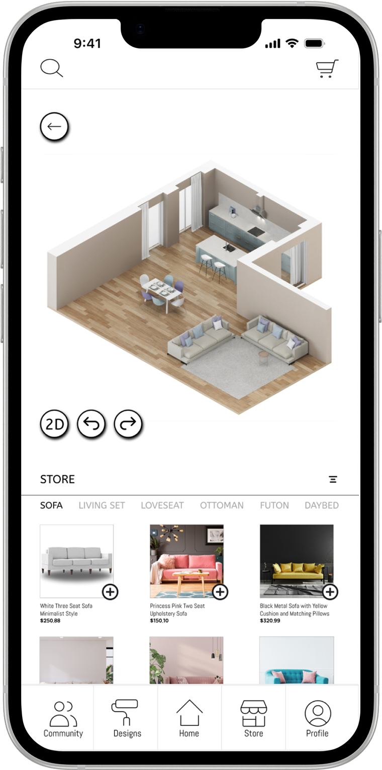
I designed a user flow that streamlines profile setup and floor plan projects by optimizing navigation, simplifying form inputs, and strategically placing calls-to-action to encourage progression. This reduces friction and facilitates floor plans and products exploration.

Dynamic Product View
Users have the option to quickly preview products via a pop-up, then access detailed views with dimensions, materials, manufacturing origin, and more. This creates a seamless, informative shopping experience, increases engagement, and boosts the likelihood of completed purchases.

Clear Navigation
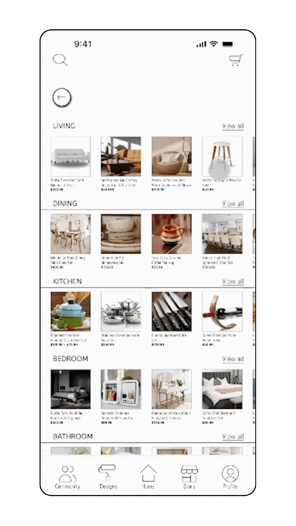
With clearly labeled bottom navigation icons for Designs, Store, and Profile, users can effortlessly navigate key pages. The Home page includes a top Call-to-Action button, followed by sections for Designs, Store, and Community. This setup provides multiple access points to essential pages, encouraging users to create, manage, browse, and purchase, thus enhancing accessibility and improving the overall user experience.

Clean and Intuitive Design
I kept the background white to highlight the Call-to-Action button, users' projects, and product listings, enhancing visibility and ensuring easy access to key features. I also positioned the search engine and cart icons separately from the bottom navigation to improve accessibility and maximize screen space.
Challenges
Readability & Visibility Issue

I realized product details might be difficult to read, but enlarging them would take up too much space. In retrospect, it’s better to position additional products further down and dedicate the space above the fold entirely to the current product listing, ensuring all details are readable.
Underdeveloped Components

Search Engine
Shopping Car
Contact Support
I hadn't fully conceptualized the app's search engine, which could significantly impact accessibility. The shopping function also needs further improvement. Additionally, placing a support button more visibly would help users address in-app issues, enhancing accessibility and user experience.

The titles and prices are too small because of how crowded the row was, affecting visibility. In future projects, I will make sure to space products to keep important information large enough to read, enhancing visibility.

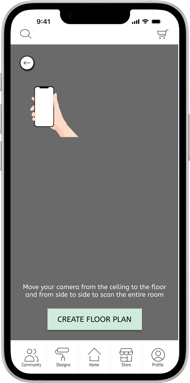
Another underdeveloped key feature is room scanning. This feature would enable the app to visualize and capture details of a user's living space, generating an accurate floor plan. Additionally, a user flow for edge cases where manual floor plan adjustments are needed should be analyzed and addressed.
User Feedback

"Button shadows should be revised to enhance visual design and user experience."

“I really love [your design]. But you could add a sticky navigation or a button that brings you back to the start.”

Other
"The interactive fields should be improved for a better testing experience. Also, the budget questionnaire should include ‘Other’ so I have more customization."
Conclusion
Through this project, I learned how to effectively address user problems by designing a clear main user flow. I prioritized P0 components such as the Call-to-Action button, Projects, and Store function, ensuring usability and accessibility. I also gained experience in building and organizing a design system to maintain consistency across UI screens. Additionally, I explored simple yet effective interactions that enhance the overall user experience.
Thank you for walking through this case study with me!
For future projects, I plan to:
-
Establish a design system before creating mockups to improve consistency and efficiency in prototyping.
-
Be more mindful of size and spacing to ensure components are clearly visible on mobile screens.
-
Develop and integrate key features, such as the search engine, when necessary to better demonstrate user interactions in prototypes.
By refining my approach, I aim to create more seamless, user-friendly designs while optimizing my workflow.
.png)


KUNGBREW CAFE
I redesigned KungBrew’s website and brand assets, creating a CTA-driven, cohesive experience with an optimized logo and scalable design system for long-term growth.

Read my other projects
.png)
