NGUYEN

.png)
KungBrew Cafe
Revamping the KungBrew brand and website to enhance brand identity with unique typography and a cohesive color palette. Focusing on effective CTAs to boost conversions and create a seamless online experience.
• Role: Product Designer
• Project: Brand Identity & Website Redesign
• Tools: Wix Studio . Figma . Adobe CC . Canva
Introduction
As a product designer, I worked closely with Hana Gallmeyer, the owner of KungBrew Cafe, and her team on the redesign project. Our main goal was to align KungBrew’s new branding and website with its unique theme and aesthetic, separate from Kung Food AmerAsiaa, and made sure we could support KungBrew's scalability and long-term growth with the new design system.
KungBrew Cafe is a locally owned specialty tea and coffee shop located in Covington. It was launched in 2024 as an extension of Kung Food AmerAsia, a Taiwanese family restaurant. However, as KungBrew developed and established a new identity, its previous branding and website needed a complete redesign to better appeal to its unique business and customer base.
Challenges
KungBrew's previous logo closely resembled Kung Food's logo, using the same font and color scheme, which did not effectively represent KungBrew's feminine and Zen aesthetics. Moreover, KungBrew Cafe did not have a cohesive design system to establish a unique brand identity. The old website was also created using Google's free builder, lacking functionality and optimization.
Role
As a product designer, I designed the new website using Wix Studio, creating a clear information architecture and call-to-action elements. I utilized Figma to design and document various new assets, including the logo, typography, and color palette. Finally, I transferred ownership of the website to Hana, along with a design library with comprehensive notes and instructions. I also offered ongoing support for any potential issues that may arise.
Goals
KungBrew Cafe needed a new logo that reflected its brand and values. The design system needed to be thoroughly documented and optimized for scalability. Finally, KungBrew's website must be consistent with the new brand design, with improved functionality and cross-device responsiveness. All of these would improve brand awareness, enhance user experience, and drive engagement for the business.
Outcome
I successfully assisted KungBrew Cafe in creating a new brand identity by designing an optimized logo and a complete information architecture. The website is fully functional, visually appealing, and aligns with KungBrew's aesthetic. Additionally, the website supports online orders through Square integration, boosting revenue beyond event signups.
Impact
100%
of KungBrew’s customers and team members agreed that the new logo and brand assets accurately reflect the company’s identity and values.
200
page views within the first week of the website launch.
100%
of respondents said the new website feels more modern, visually appealing, and cohesive.
The Old
The Old
KungBrew's website required a complete redesign, including a cohesive and compelling aesthetics. The webite should also contain essential business information, CTA elements, and other relevant assets.
KungBrew's logo needed a redesign to strengthen the band's identity and optimize it for web and other uses.web and other uses.
KungBrew's previous website needed a more contemporary design to attract the audience. The homepage was missing an engaging hero section, distinctive brand assets, and clear calls-to-action (CTAs). Furthermore, it did not offer information about the business, which limited brand awareness.
KungBrew's old logo didn't fit its identity as a specialty tea and coffee house emphasizing tradition, Zen, and community. Moreover, the logo did not appeal to KungBrew's core customer base, primarily women aged 18 to 54.
Additionally, KungBrew's official domain name needed to be successfully added to the Google business site, which would increase KungBrew's credibility and legitimacy to current and potential customers.
KungBrew's menu page needed a new, visually appealing, and interactive design. Inspired by Starbucks's online ordering feature, I wanted to integrate Square into the menu. This would assist KungBrew's customers in placing online orders in advance, enhancing convenience and increasing KungBrew's revenue.
The old typography doesn't match KungBrew's aesthetic. The new typography needed to reflect a tranquil, fluid, and poetic aesthetic of the traditional Asian tea and calligraphy culture.
Additionally, the domain name issue should be resolved to ensure accurate presentation on Google's business site, significantly enhancing the business's credibility and brand awareness.
Target Audience
Women
Due to the establishment's specialty, KungBrew's most loyal customers are women aged 18 to 54. Therefore, KungBrew's rebranding will incorporate feminine and Zen-like elements to appeal to its core customers, ensuring the existing customer base remains steady.
Feminine
Zen
Cohesive
story
Unique
qualities
Engaging
offers
Newcomers and Tourists
To ensure long-term sustainability and growth for KungBrew, developing a cohesive and engaging narrative that effectively communicates the brand's identity, origins, purpose, and unique qualities is crucial. This narrative will not only generate new interest but also deepen customer engagement.
Brand Design
Color Palette
KungBrew Cafe features a unique interior with a large hand-painted mural that stretches across multiple rooms. This mural beautifully depicts various Asian landscapes and cultures. Given its significance, I extracted colors from the painting for the brand's color palette.
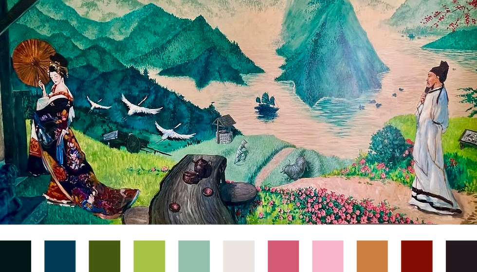
After thorough testing and evaluation, I selected four colors for the brand's palette. Inspired by the mural and featured item, these hues ensure consistency across the online and physical space, capturing KungBrew's nature-driven, harmonious, Zen-like, and inviting essence.
One of KungBrew's standout menu items and bestsellers is the matcha latte. At the owner's request, I explored ways to incorporate this menu item into the brand identity design, one of which is to utilize the unique colors of this beautiful beverage.
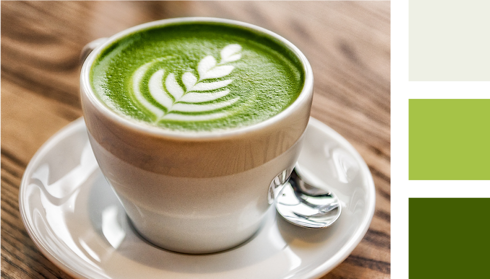
After thorough testing and evaluation, I selected four colors for the brand's palette. Inspired by the mural and featured item, these hues ensure consistency across the online and physical space, capturing KungBrew's nature-driven, harmonious, Zen-like, and inviting essence.
011715
455A11
A6C347
ECE6E3
After thorough testing and evaluation, I selected four colors for the brand's palette. Inspired by the mural and featured item, these hues ensure consistency across the online and physical space, capturing KungBrew's nature-driven, harmonious, Zen-like, and inviting essence.
One of KungBrew's standout menu items and bestsellers is the matcha latte. At the owner's request, I explored ways to incorporate this menu item into the brand identity design, one of which is to utilize the unique colors of this beautiful beverage.
011715
455A11
A6C347
ECE6E3
Typography
I experimented with many fonts that have a calligraphy quality for the name brand and titles, reflecting Asian heritage and aesthetic.
As a result, Comforter Brush Regular was the perfect choice, as it captures the elegant brushstrokes of traditional calligraphy found in cultures such as China and Japan while still ensures clear readability.
KungBrew Cafe
To keep the website's aesthetics consistent, I used the same font in a smaller size for titles on subpages such as About Us, Menu, and Contact.
The font of the body texts needs to complement the title, ensuring readability while balancing traditional calligraphy with a modern look.
So, I selected Zain Light and Regular, two variations of the Zain sans serif font family. They complement Comforter Brush Regular with subtle handwritten feel, while maintaining strong contrast and readability.
About Us Menu
Typography
I experimented with many fonts that have a calligraphy quality for the name brand and titles, reflecting Asian heritage and aesthetic.
As a result, Comforter Brush Regular was the perfect choice, as it captures the elegant brushstrokes of traditional calligraphy found in cultures such as China and Japan while still ensures clear readability.
To keep the website's aesthetics consistent, I used the same font in a smaller size for titles on subpages such as About Us, Menu, and Contact.
The font of the body texts needs to complement the title, maintaining readability while balancing between traditional calligraphy and contemporary texts.
So, I selected Zain Light and Regular, two variations of the Zain sans serif font family. They have a subtle handwritten feel yet retain strong contrast and readability.
KungBrew Cafe
About Us
Menu
Contact Us
Subtitle
Heading 1
Heading 2
Paragraph 1
Paragraph 2
Subtitle
Heading 1
Heading 1
Heading 2
Paragraph 1
Paragraph 2
I want the logo to appear more feminine and elegant, so a circular frame is ideal.
Logo
I wanted to design an abstract and minimalist logo with the abbreviation KB and a green-white hues.
455A11
5F9357
A6C347
FFFFFF
I wanted to explore the concept of matcha latte art, so I created an abstract B resembling a heart shape, imitating a foam heart.

Collaborating with the owner, I picked out the most simplified and abstract version and developed on top of it to create more variations.

.png)


After testing various color options for the webpage, we finalized the logo design with this version. It meets all requirements: simplicity, abstraction, latte art inspiration, femininity, and is optimized for web use and beyond.
Logo
I wanted to design an abstract, latte art-inspired logo with the abbreviation KB, so I chose white and a few green hues that match the brand's color palette.
I want the logo to appear more feminine and elegant, so a circular frame is ideal. I created some versions of an abstract B resembling a heart shape, imitating a milk foam heart of a latte art.


455A11
5F9357
A6C347
FFFFFF
I combined the hearts and frame to create the first two versions of the logo. I used the light green A6C347 first because it matched the color of the latte art.
.png)
From there, I developed variations of the initial logo designs, integrating KB and the color palette while applying different levels of abstraction.

.png)
After our initial review with the owner, we decided to choose the rounder version of the logo to convey femininity and fullness. I designed the "K" to nestle within the "B," making it almost an integral part in a few color variations. This design keeps the logo minimalist and scalable.
We ultimately finalized the logo design with the version shown below. The simple combination of dark green and white keeps the logo visible at all sizes. The artwork within the frame creates an abstract representation of the KB signature while also illustrating the latte art concept.
We are confident that this logo meets all requirements: it is simple, feminine, abstract, and inspired by latte art. Additionally, the logo is optimized for website, social media, and other promotional materials.
Website Design
The Hero
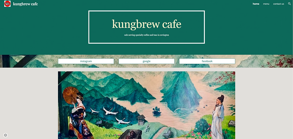
My goal was to design a visually compelling hero section that uniquely reflects the Asian, Zen, and calligraphic aesthetic. I framed the hero's photo within an organic shape, creating a more fluid, natural, and visually appealing transition between the hero and the rest of the webpage.
I also chose a blush beige background to contrast with the darker photography, creating a warm and inviting aesthetic that complements the brand’s identity. The visual style is classic and Zen-inspired, with high-quality images showcasing the tea and brewing ceremonies to evoke a sense of warmth and tradition.
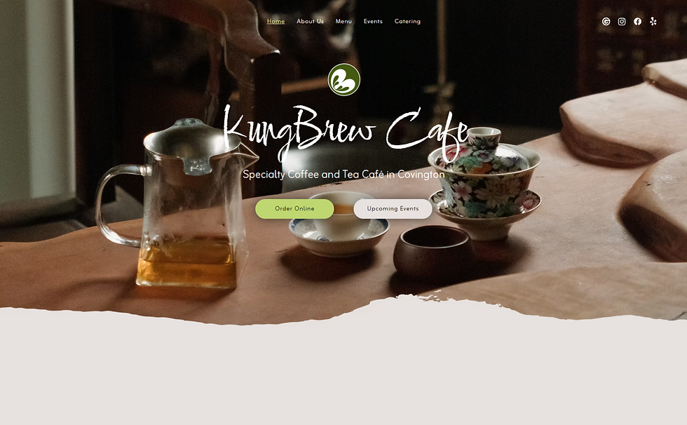
Main CTA
The website’s two primary actions are tea event signups and online ordering, so I placed the 'Order Online' and 'Upcoming Events' buttons prominently in the hero section to ensure easy access for users.
Following the hero section, I emphasized KungBrew's specialty tea rituals, detailing their origins and cultural significance. This approach encourages potential customers to explore these rituals and, ultimately, sign up for the event through the Upcoming Events section below.


Homepage Content
Next, I highlighted KungBrew’s bestsellers and added a direct link encouraging visitors to explore the menu page. This design choice helps guide users to the menu page, ultimately leading them to place an online order through the website.

Initially, I designed floating customer review bubbles to add a dynamic element to the page. However, I found that moving text made the reviews difficult to read. To improve usability, I simplified the layout into two static columns and included a button linking to the full Google reviews.
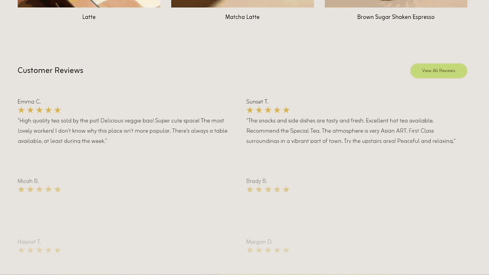
Hana also wanted to showcase highlights of KungBrew’s unique interior, tea room, and bestselling items. So, I added a gallery section just below the reviews, followed by featured articles about the business. This layout not only adds visual interest but also enhances credibility and reinforces KungBrew’s brand story.

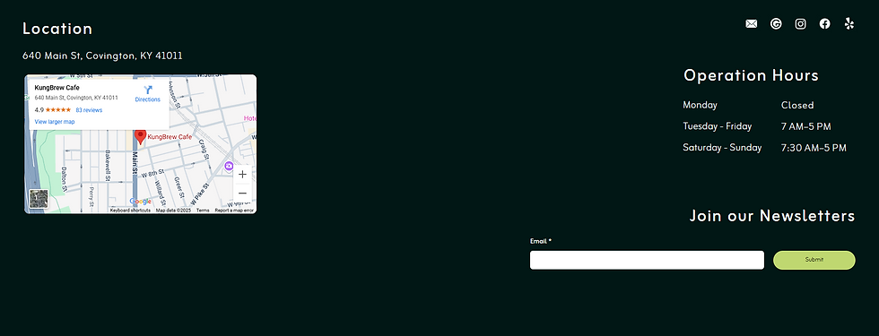
Additionally, I chose a dark green background for the footer to contrast with the main background and create visual depth. This section also draws attention to key details such as location, contact information, social media links, and the newsletter signup, providing users with visibility to essential information.
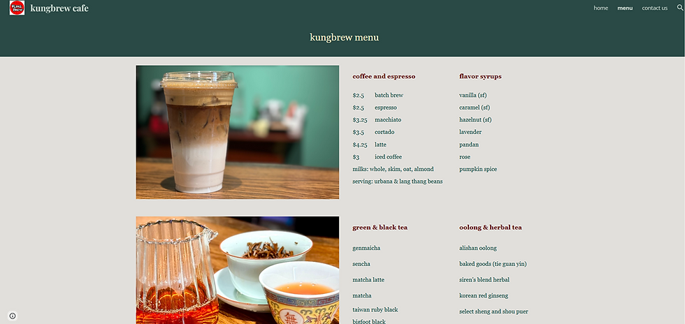
Menu & Online Ordering
I used the tab function to streamline the menu, keeping all categories clearly labeled and easy to navigate.
Each item features high-quality photos that enhance visualization and improve user experience.
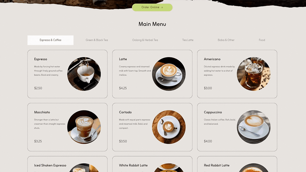
To make sure the "Order Online" button remains easily accessible, I added light JavaScript to create a floating button that appears as user scroll through the menu. The floating button is positioned in the top-right corner and semi transparent, visible enough to prompt action without obscuring the menu. This allows users to place an order whenever they’re ready without interrupting their browsing.
Outcome
90% of participants prefer the new logo design.
100% agree that the new logo and brand assets reflect KungBrew's identity and values.
Optimized Brand Assets
Before its launch, the owner and I collected feedback on the new logo design from 15 participants, including KungBrew's employees, customers, and non-associates.
90% of participants prefer the new logo design.
100% agree that the new logo and brand assets reflect KungBrew's identity and values.
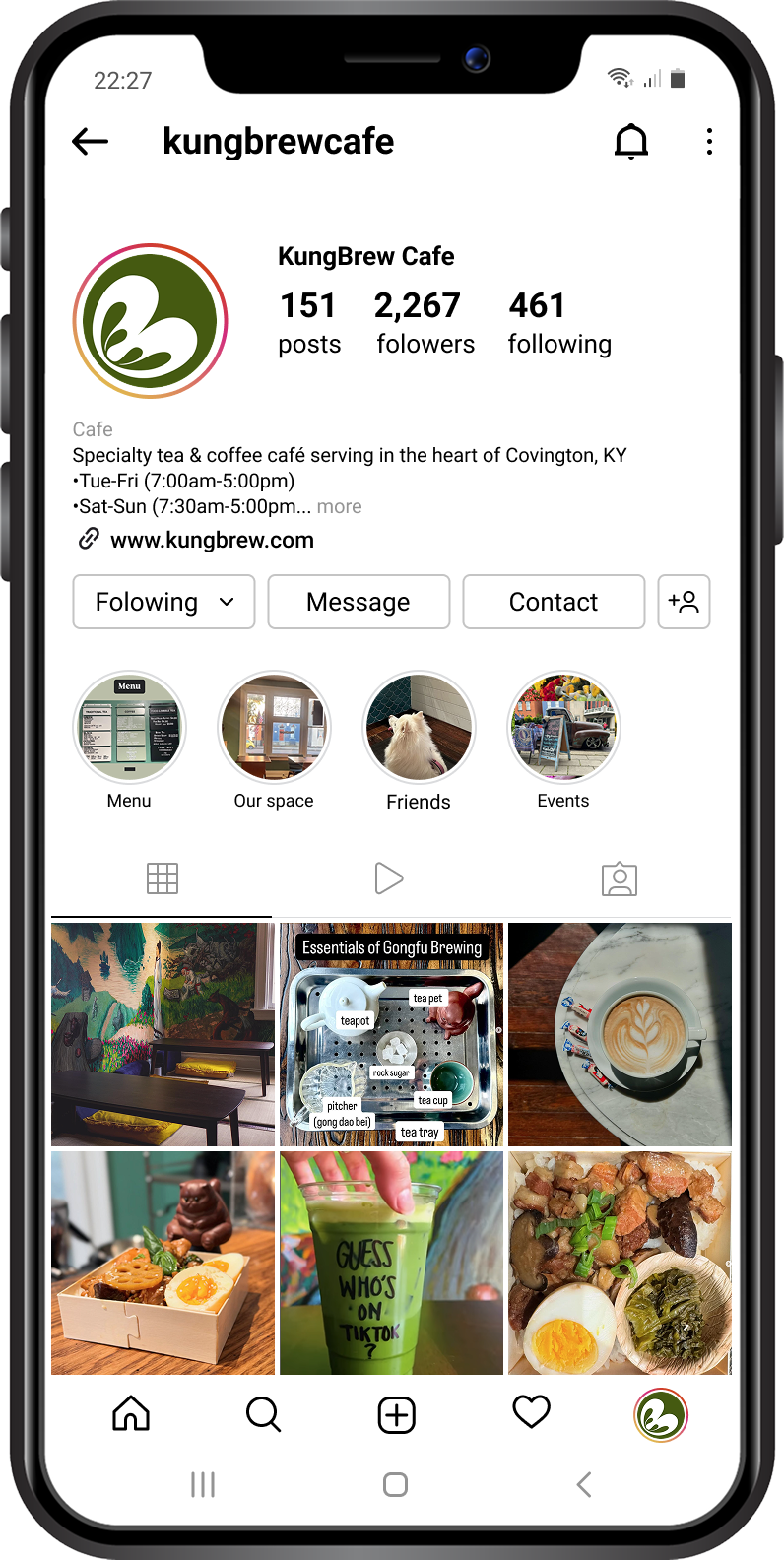
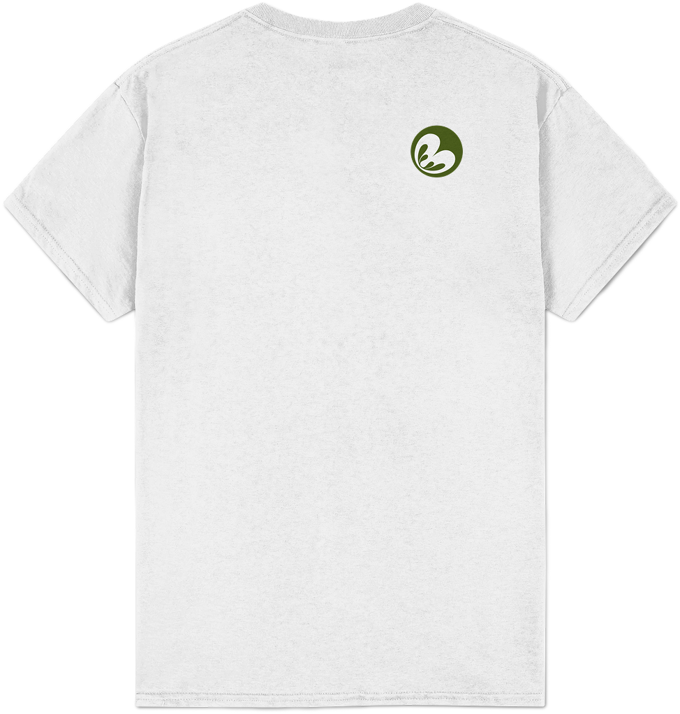
The logo is optimized for web and mobile use, as shown in KungBrew's Instagram profile below. It retains its details and visual impact even when displayed smaller.
90% of participants prefer the new logo design.
100% agree that the new logo and brand assets reflect KungBrew's identity and values.
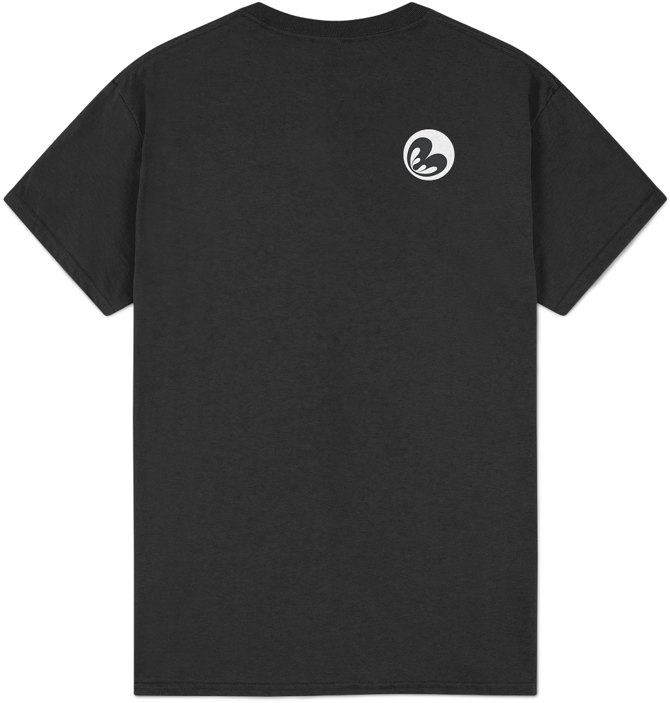
KungBrew's logo and name are also suitable for various promotional products, such as to-go cups, mugs, merchandise, and more, if the owner decides to expand the brand's reach through these items.
.png)
Updated Website
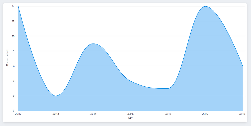
We officially launched KungBrew's new website on July 10. After the first 7 days, we achieved 58 visits, 200 page views, and an average view time of 6 minutes.
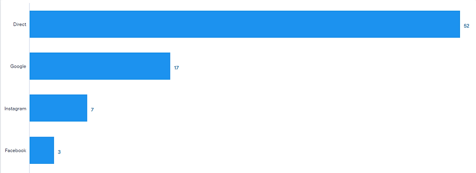
Most of the visits are direct or from Google, which aligns with our goal of driving traffic primarily through KungBrew’s Google Business profile.
The majority of visitors are located in Ohio and Kentucky, which is encouraging since they represent potential customers for KungBrew.
We also asked the same people to evaluate the new website design and compare it to the old website.
100% agree that the new website is more modern, visually appealing, and cohesive.
All in all, the traffic to the website has been steady, showing promising potentials for KungBrew's branding and long-term growth.
Conclusion
I successfully redesigned and optimized the KungBrew website and brand assets, conducted user testing to validate the new brand identity, and delivered all assets to the owner to support long-term growth.
Through this project, I enhanced my understanding of Wix Studio's web development features, learned how to transfer domain ownership and site deliverables to the client, and utilized Figma to design the logo and other branding assets.
In the long run, I will continue to support the growth of KungBrew by providing design consultations, updated assets, and technical solutions, contributing to their success as a product designer.

URHOME
I designed the UX/UI for a mobile interior design app that helps users make eco-friendly choices, reduce fast furniture waste, and support sustainable brands.
.png)
MEALOGY
I designed the UX/UI for a mobile interior design app that helps users make eco-friendly choices, reduce fast furniture waste, and support sustainable brands.
Read my other projects

Subtitle
Heading 1
Heading 1
Heading 2
Paragraph 1
Paragraph 2